Design motif #1a: Home - shape & pattern
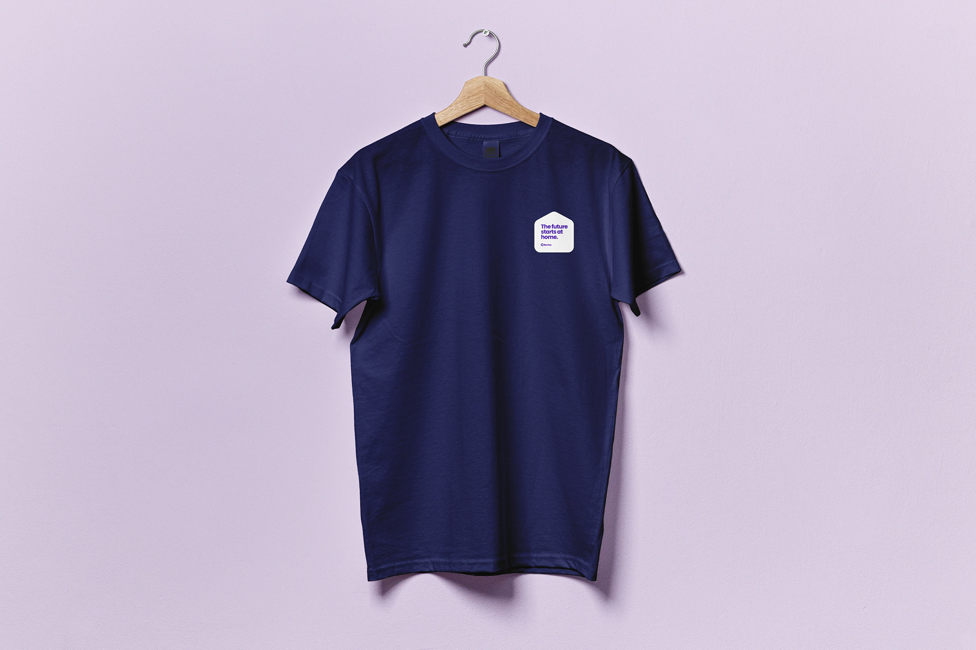
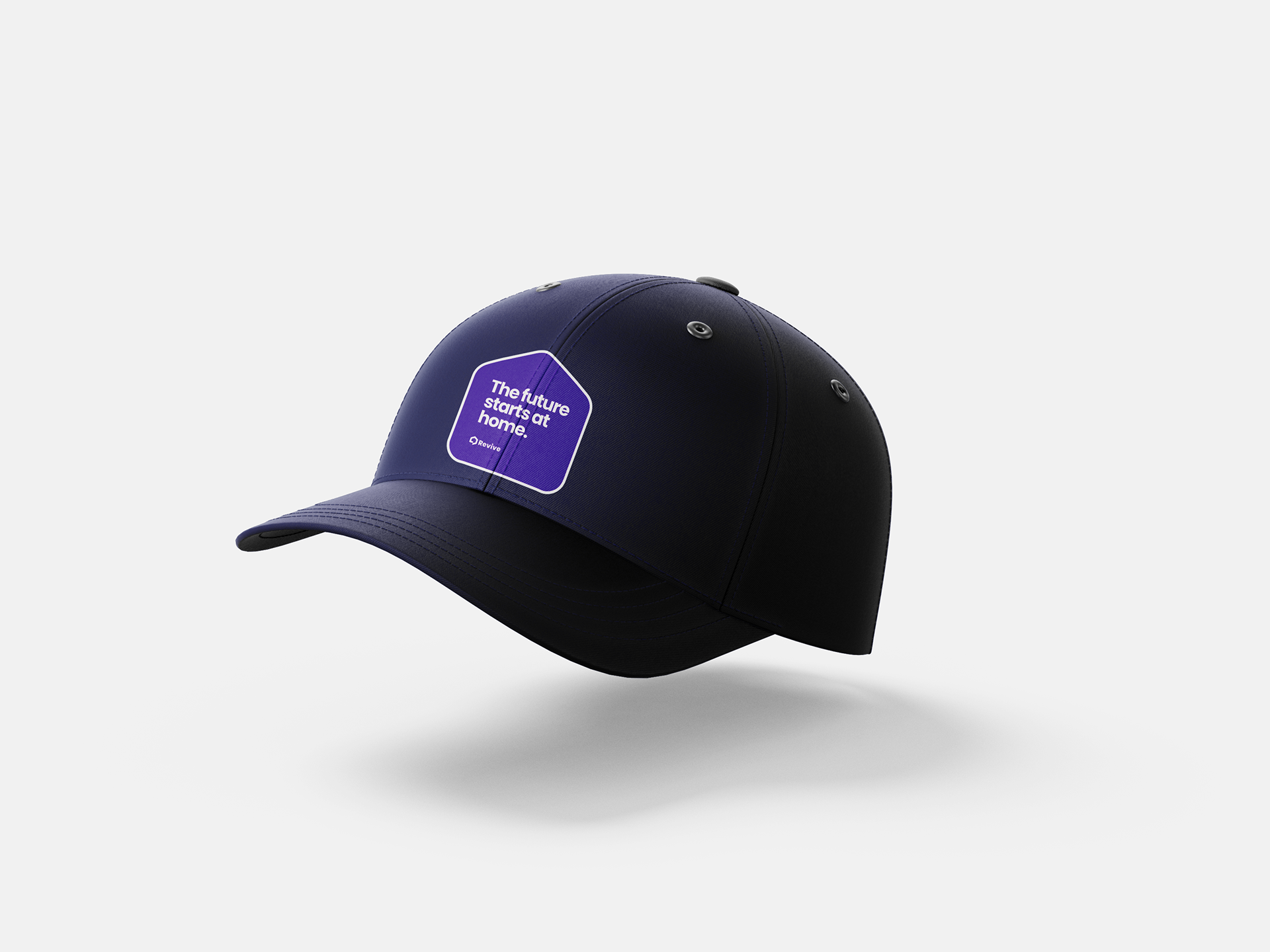
We’re taking the shape of a home — the foundational symbol of our industry, our logo, and our mission — and distilling it to its simplest form. This simplified home shape becomes a versatile container: 1.) For our tagline, anchoring our messaging visually. 2.) As the base for brand patterns, establishing a recognizable system. 3.) To explore color plays, overlays, and motion effects.
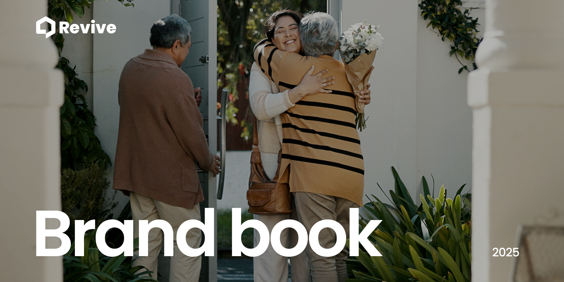
Design motif #2: Text overlay on image
Distilling the essence of what it means to have a home, to grow in it, to build on it.
Home is where everything starts. It’s where first steps are taken, core memories are made, and futures are shaped. It’s the heartbeat of community. The cornerstone of the American dream and a gateway to a more prosperous life. While the journey of homeownership has changed, its promise has not. Revive is here to empower smart ownership through every phase of buying, living, and selling. Because the future doesn’t just happen. It’s built—one decision at a time.
Sentiments: Nostalgic/Generational Bond/Solo Reflection-Expression/Togetherness/Hopeful Future (sunrise, morning sky, birthday wish)/Everyday Love(making food for kids, dancing in kitchen)/New Beginnings (unlocking front door)/Firsts (day of school, first steps, learning to ride bike)/Celebrating (accomplishment, growth, progress-graduation/promotion/baby/marriage)
Design motif #3a: Ripples — home
Ripples play a large role in the Revive visual identity. (Jim Rohn insp—everything affects everything) Ripples help convey a sense of impact, amplification, and momentum — representing how one smart decision can lead to greater wealth, opportunity, and meaning. They symbolize progress and growth, with home as the foundation and the gateway.
Home, and homeownership, is the starting point for financial security, prosperity, and a better future.
Design motif #3b: Ripples – Text
Design motif #4: Tagline on home path
Color expansion on design motif #1a: Home - shape & pattern

