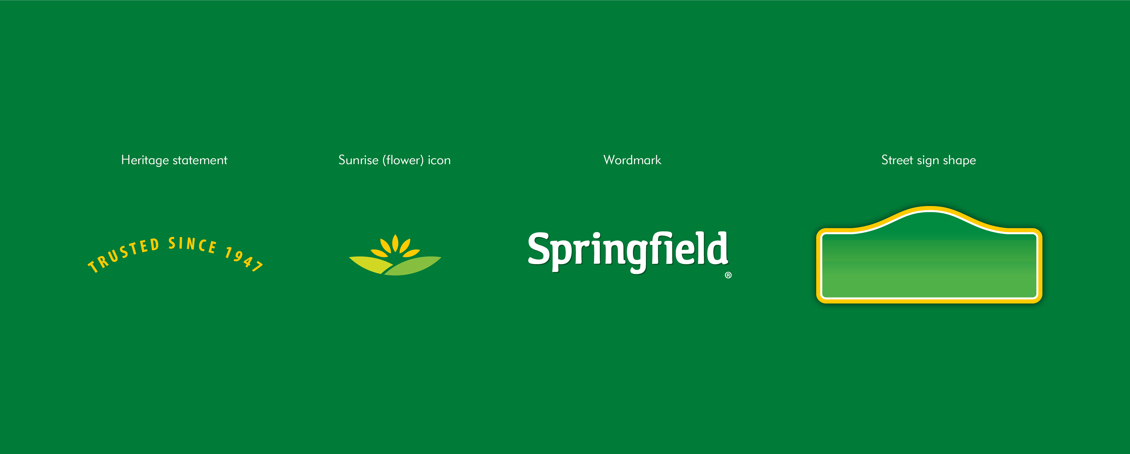
Logo
To support the brand’s core essence of neighborly, trusted quality and value, an evolutionary new brandmark was designed to link the brand to the corner street signs often found in small-town America.
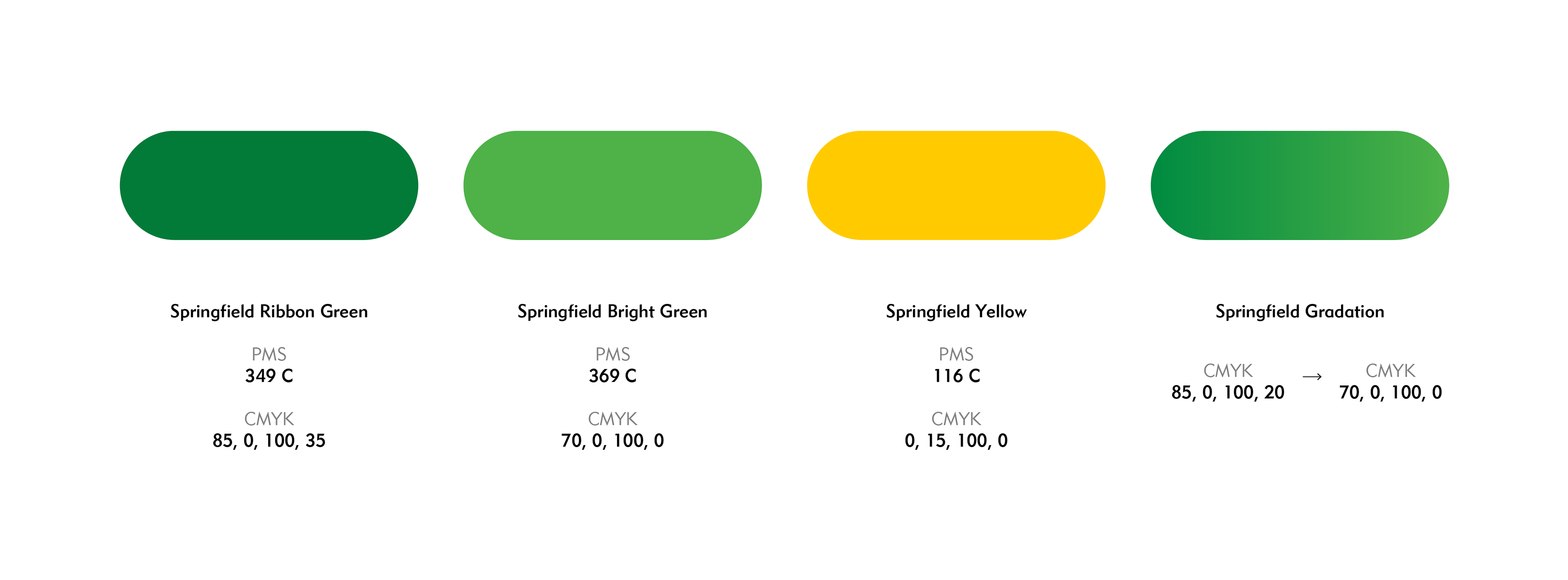
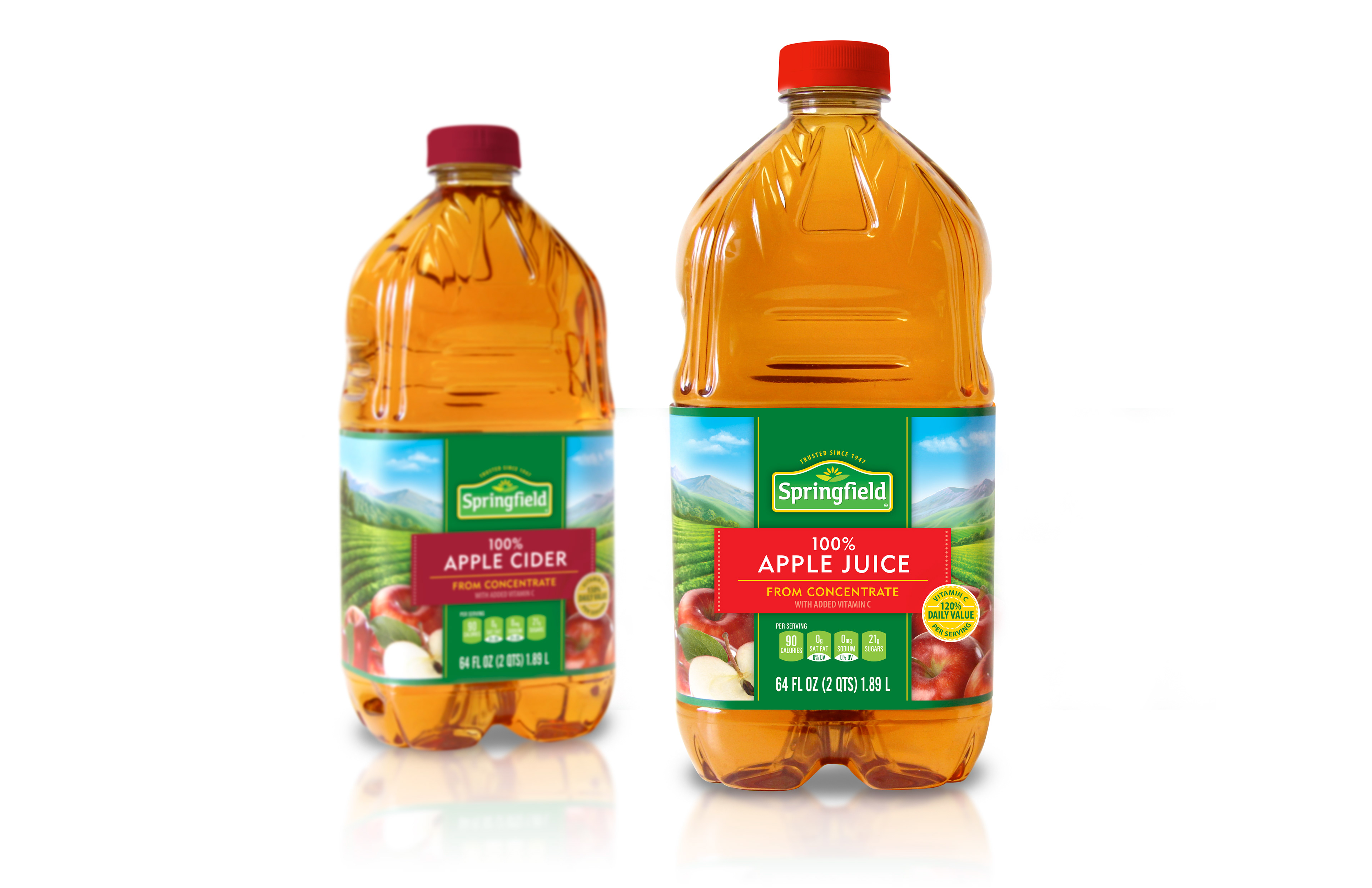
Color and type
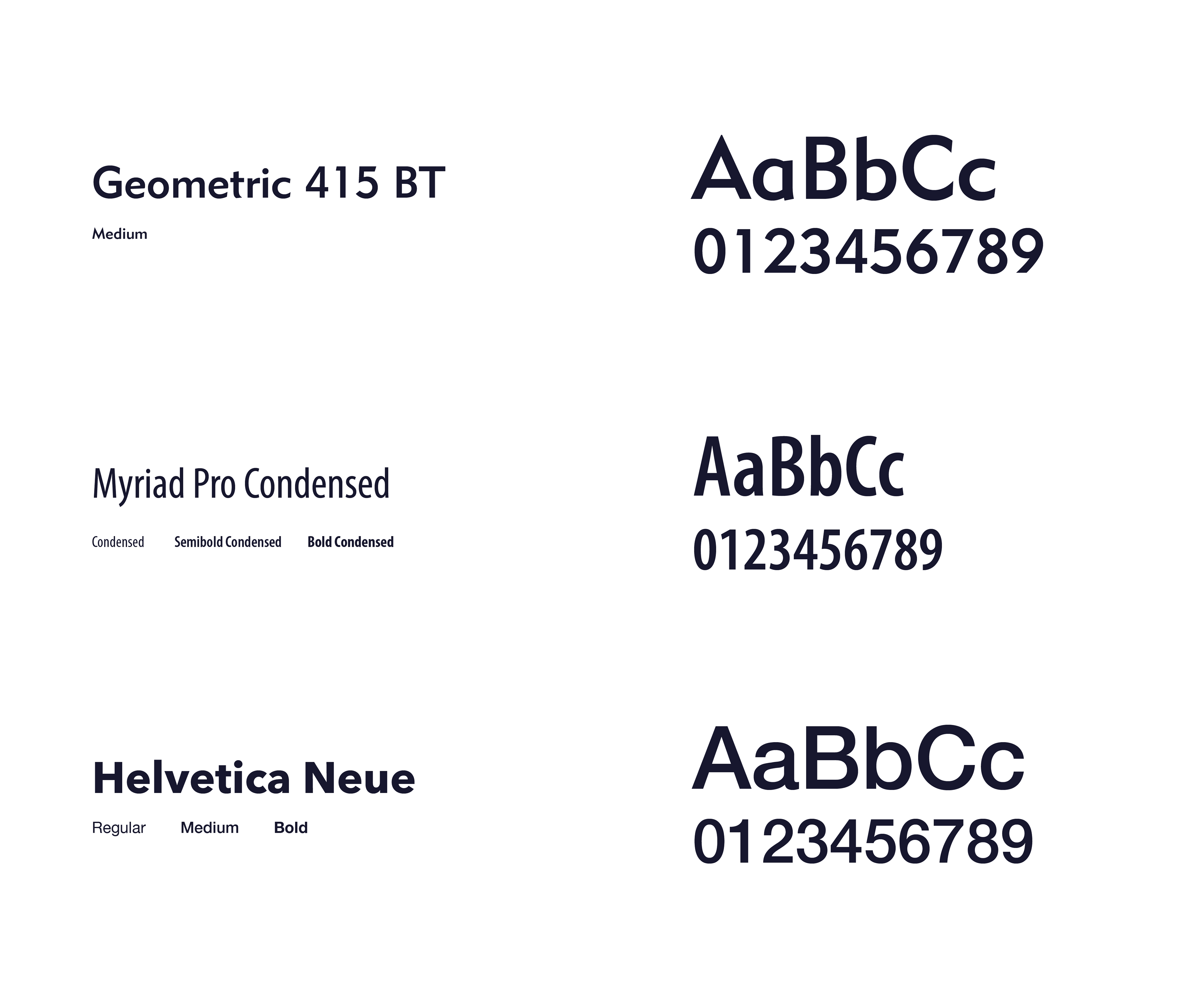
A color palette of bright greens and sunrise, flower yellow was selected to communicate that Springfield products deliver the best in freshness and ingredients. The brand has three typefaces curated for display type, secondary copy, and legal/nutrition facts.

Visual elements
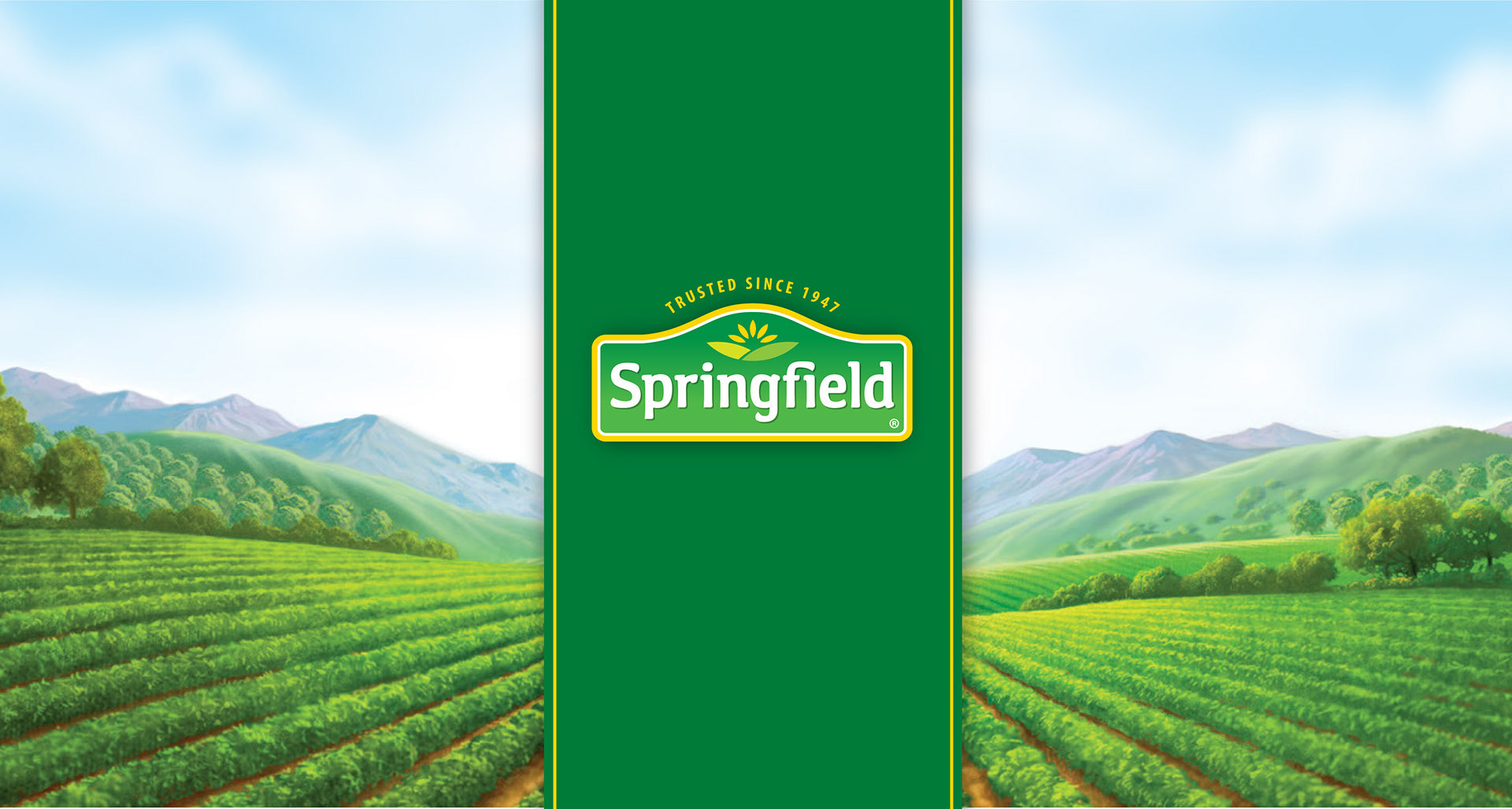
The newly designed farm landscape illustration showcases fertile farmlands, clear skies, and fresh foliage of the spring season to capture the brand’s fresh and natural qualities. The Springfield ribbon presents the brandmark center-stage to establish appropriate hierarchy and attention.
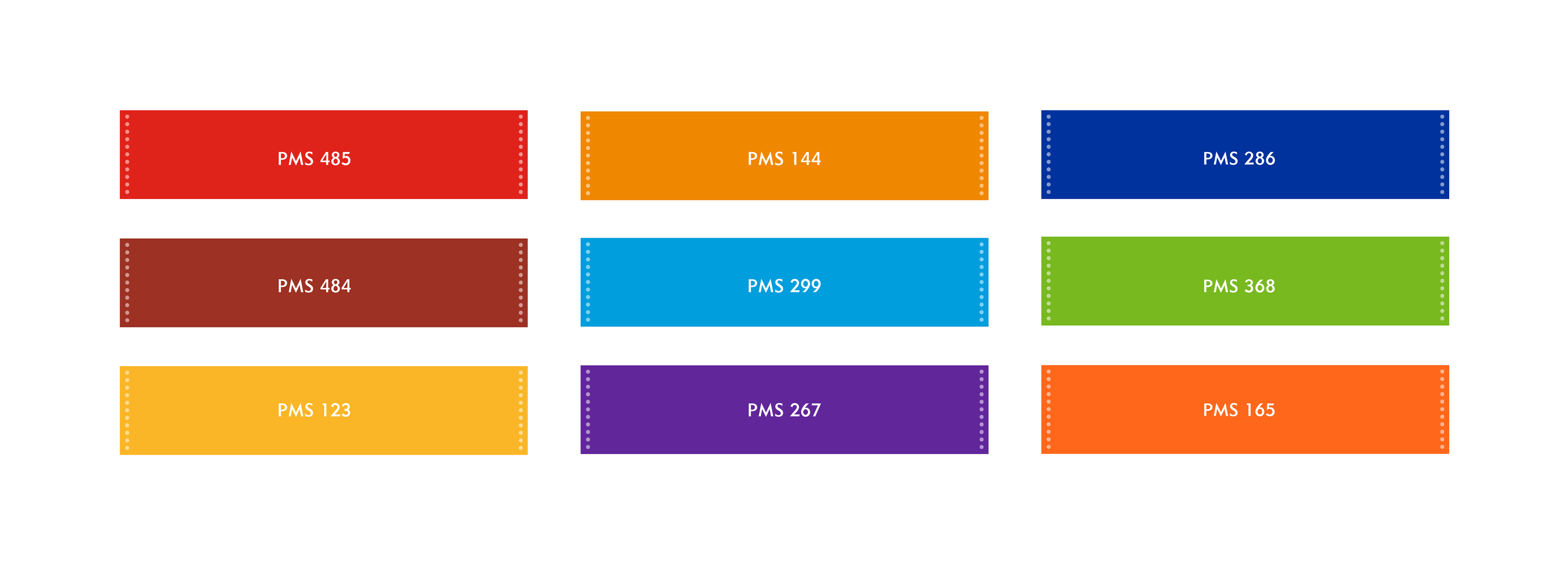
Another brand element, Springfield flavor banners, are added to designs where flavor/differentiation is needed or as established by competitive products in a category. The flavor banner colors are bright and happy, and aligned with the color palette that research shows is preferred by the Hispanic community, an important customer base for the brand.

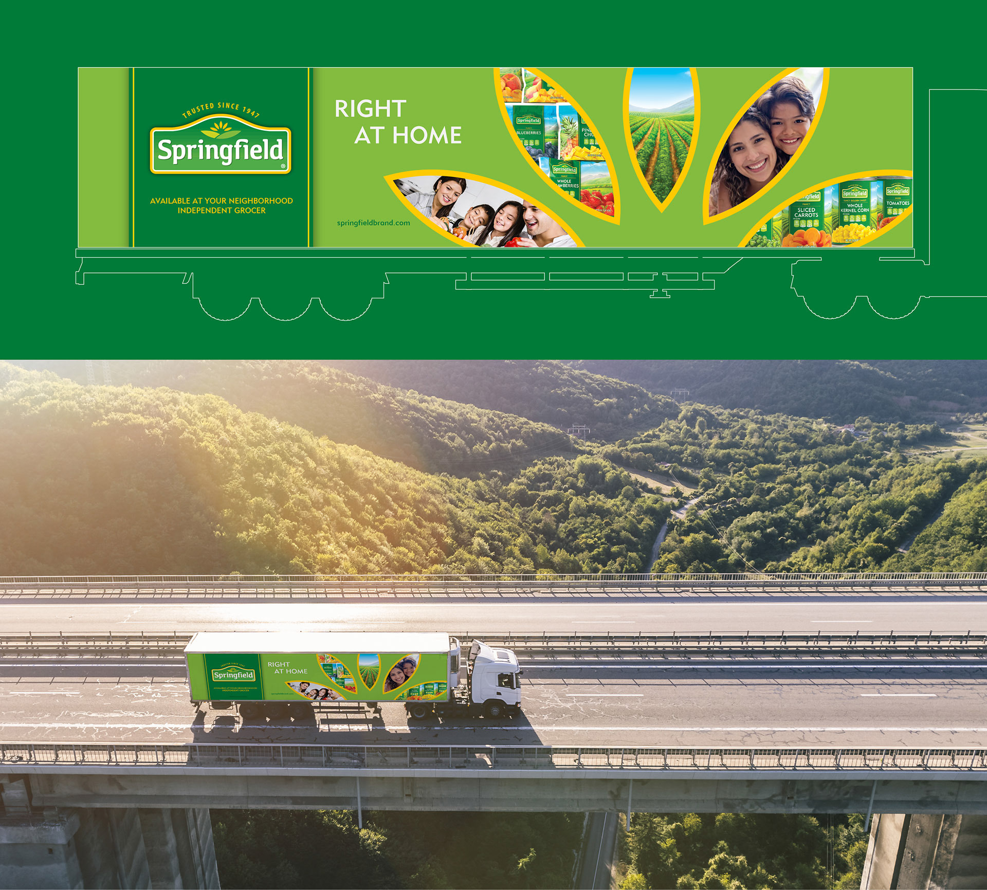
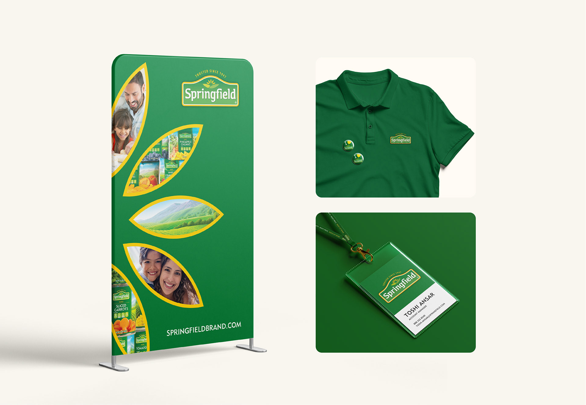
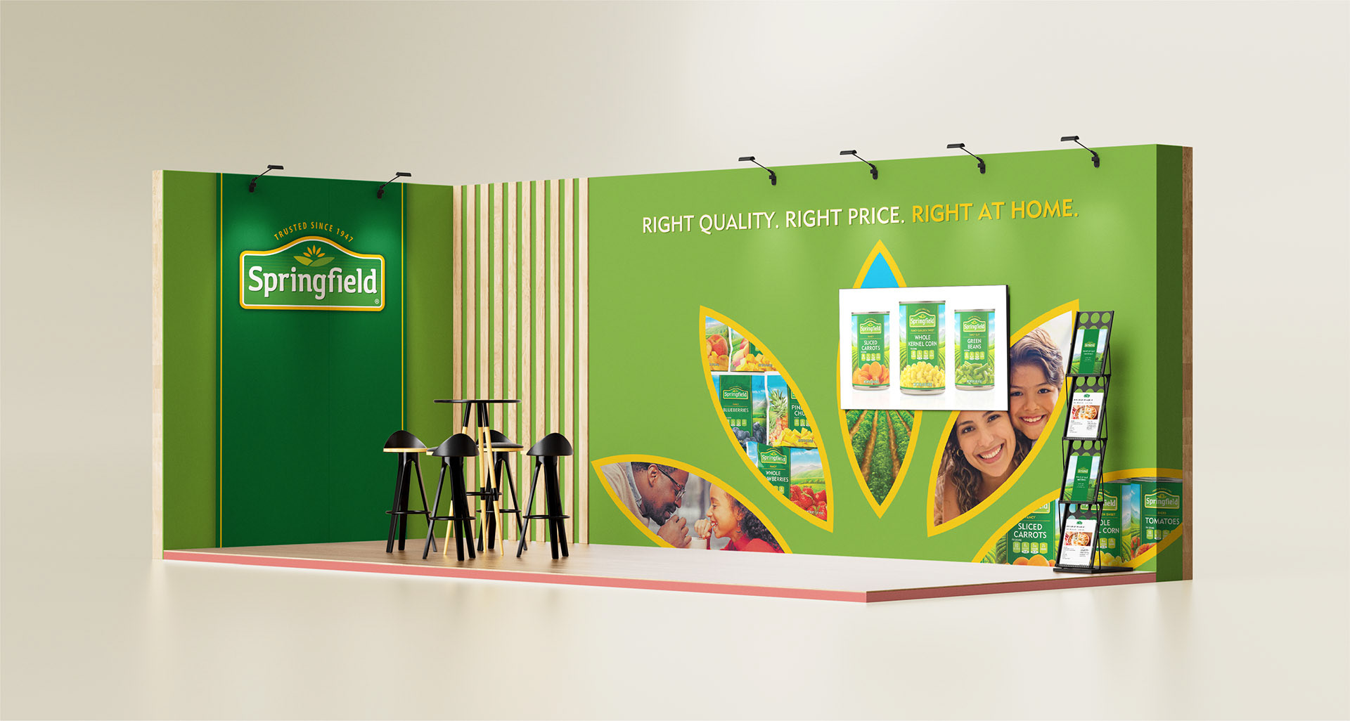
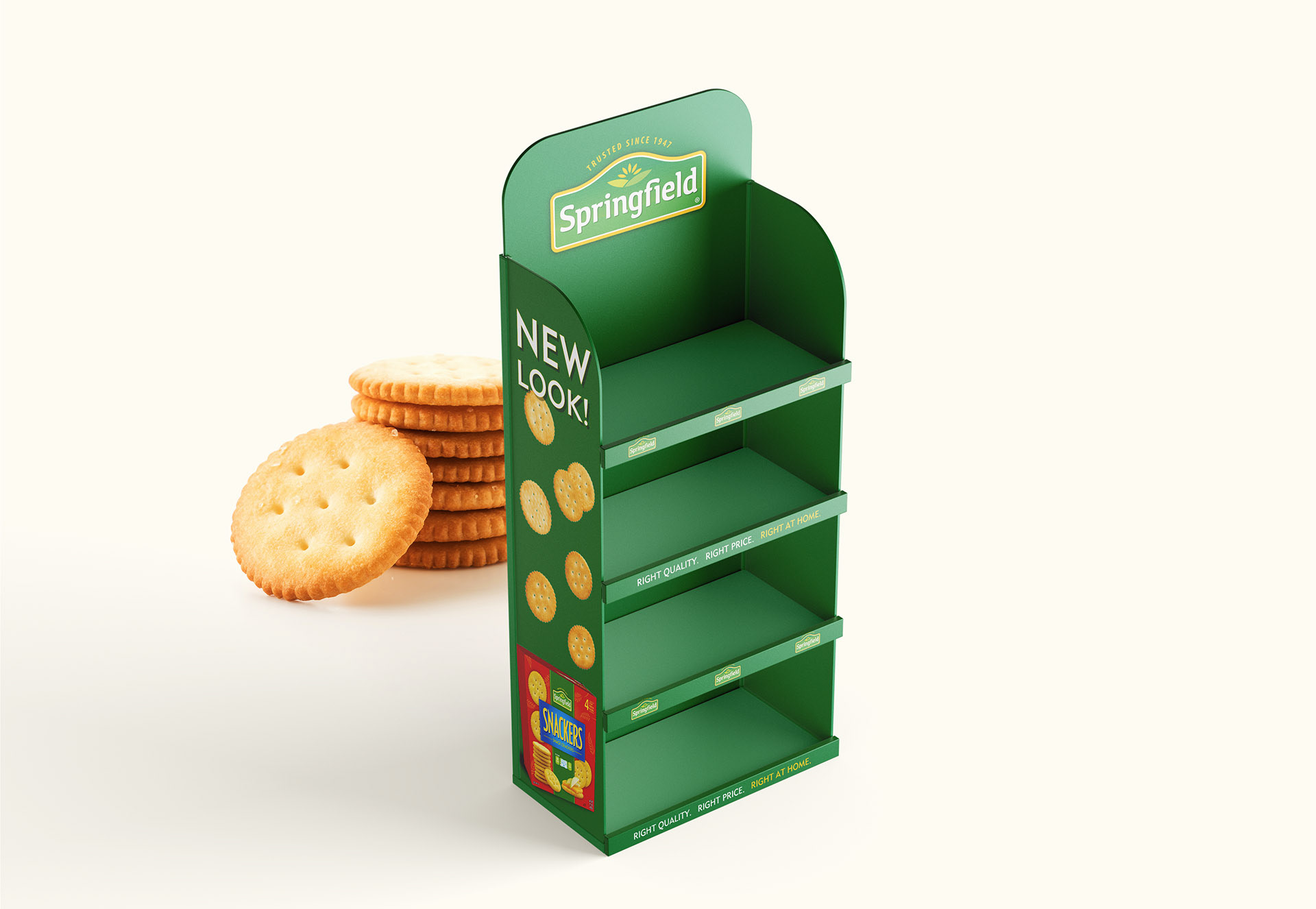
Brand collateral
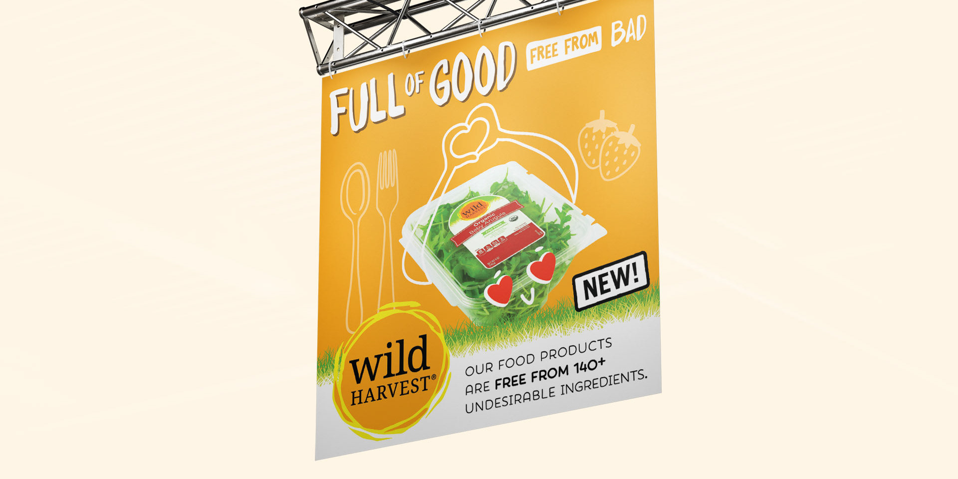
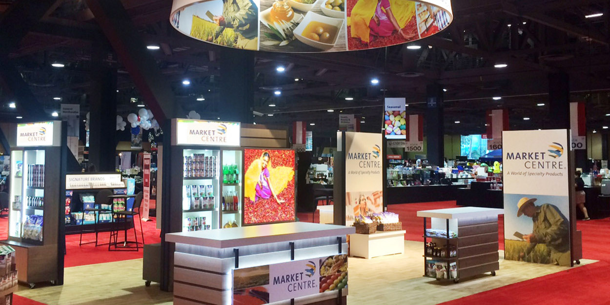
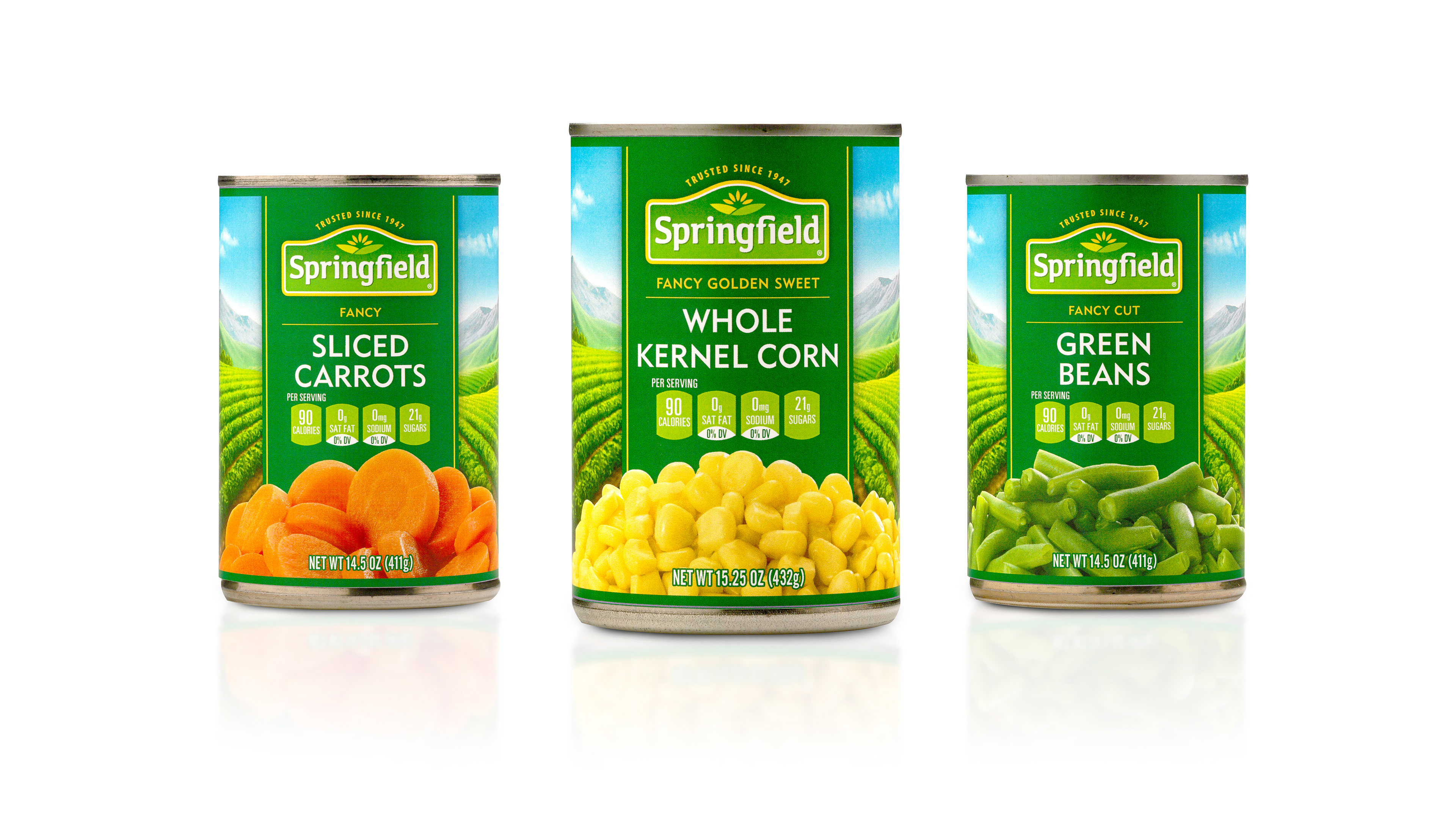
Out-of-home, in-store, online and at industry events — Springfield collateral uses the brand flower icon to display people and product photography, telling a beloved story about Springfield quality and value, enjoyed right at home.